Table of Contents
- The moment a sign either welcomes you or sends you away
- Outdoor signboard design that survives heat, glare, and rain
- Materials that change the message
- Lighting and depth: LED, 3D, and the “night shift” effect
- The science of legibility (and why your eyes love simple choices)
- A simple workflow from idea to installation
- Common mistakes that quietly cost you attention
- Keeping signage fresh without constant redesign
- The next step when you want a sign that feels like your brand
A good sign can feel like a small welcome—like the place already knows you. A weak one does the opposite: you walk past, even if you meant to stop. That’s why details like spacing and lighting matter. If you’re gathering ideas, it helps to browse a gallery of real storefront examples and pay attention to what your eyes land on first.
Picture a busy street at 6 pm: scooters, glare on glass, and five businesses fighting for attention. In that moment, the shop signboard design isn’t “decoration.” It’s a two-second conversation that answers: What is this place? Is it for me? Where’s the entrance?
The moment a sign either welcomes you or sends you away
A neighborhood bakery once swapped its crowded, all-caps board for simpler lettering and more breathing room. Same name, same location, same products. Within a week, regulars were saying, “I finally noticed you from the corner.”
That’s the strange truth of signage design: the biggest impact often comes from subtracting, not adding. People don’t read signs the way they read menus; they scan shapes and contrast, then decide whether to slow down.
A sign that works usually does three things at once:
- Names the business without effort
- Signals the category (café, clinic, salon, showroom)
- Guides the next step (door, stairs, parking, counter)
When those are clear, the rest of your brand gets a fair chance.
If you’re planning a shop front sign board design, think of it as a small system: one identity board, a few directional cues, and window graphics that repeat a single promise.
Outdoor signboard design that survives heat, glare, and rain
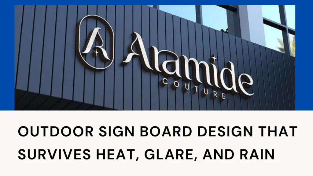
Outdoor signs live a tougher life than most people realize. Sun fades pigments, dust dulls finishes, and headlights reveal reflections you didn’t plan for.
Durability starts with visibility. If people can’t read the board comfortably, a “premium” finish won’t save it. Practical choices help:
- Matte or satin finishes to reduce midday reflections
- Layouts that still work when the panel gathers a thin layer of dust
- Letterforms with enough stroke weight to hold up from a distance
Contrast is the unsung hero here. The same accessibility principles used for screens are useful for streets, too.
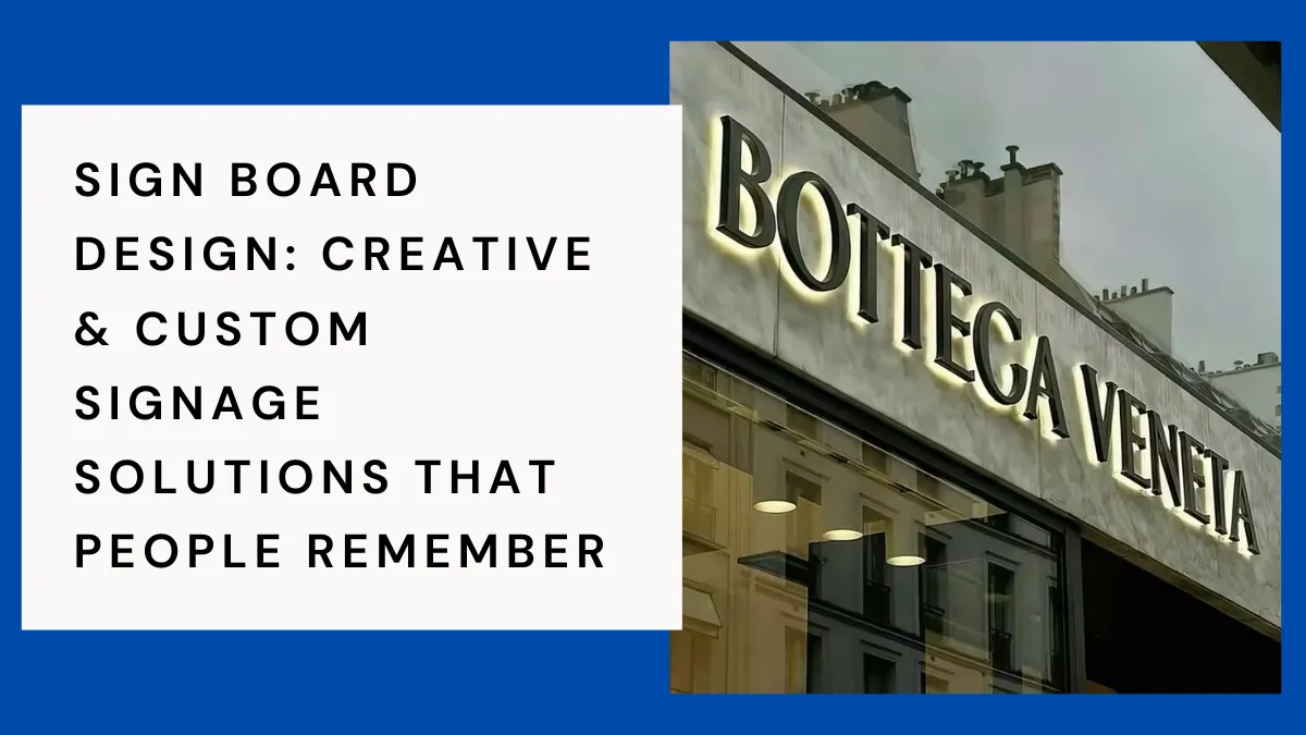
What “custom” really means when the façade fights back
Every location has quirks: a shallow canopy, uneven stone cladding, a glass wall that turns into a mirror at noon, and a corner unit where viewers approach from an angle. “Custom” is simply the design adapting to reality.
With a custom signboard design, small decisions do big work:
- A thin, elegant typeface can feel premium but may disappear in glare unless you adjust weight and spacing.
- A glossy background can look bold in a mockup, then become unreadable under sunlight.
- A beautiful logo might need simplification when you shift from printing to cut letters.
This is where branding signboard choices get practical. A mark that looks perfect on a phone screen may need tweaks for signboard printing or for layered materials like acrylic and metal.
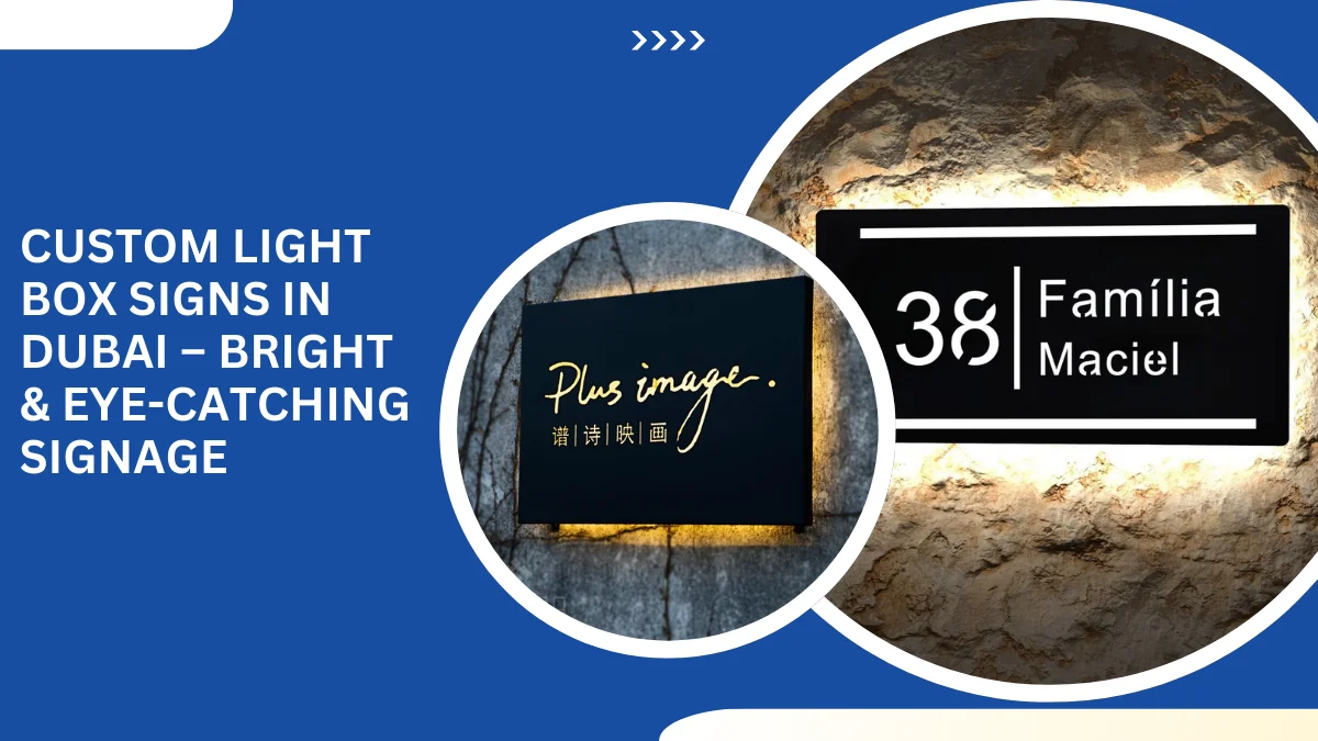
Materials that change the message
Material isn’t just a build choice—it’s a message. People sense “quality” from surfaces first.
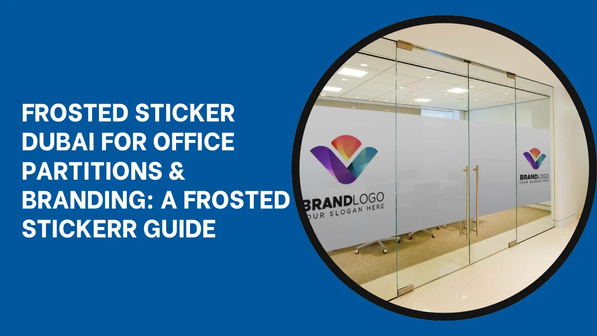
Acrylic sign board options often feel crisp and modern, especially when you add raised lettering or a frosted layer that softens reflections. Flex sign board formats can work well for larger panels, but they look best when the layout is simple, and the lighting is even. Metal finishes add weight and permanence—great for professional spaces where trust matters. Wood (or wood-look composites) can signal warmth, but needs the right coating for outdoor exposure.
A useful rule: choose your material first, then design for it. If the production method is cutting, keep the shapes clean. If it’s printing, you have more freedom for gradients and imagery—but don’t let detail outrun legibility.
For inspiration, it helps to watch how real signs behave in the wild—daylight, night shots, rainy reflections, awkward angles. A quick scroll through recent signage visuals can reveal things mockups hide, like hotspots in lighting or lettering that disappear from a distance.
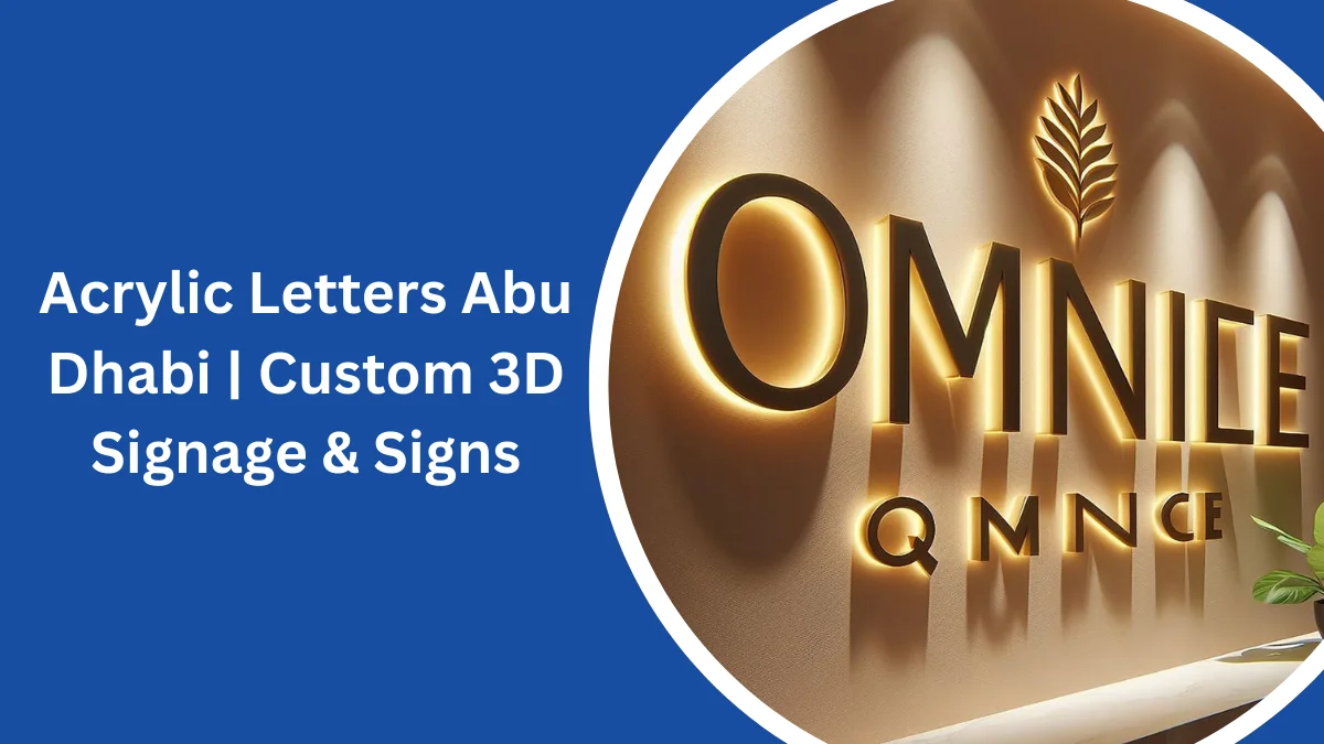
Lighting and depth: LED, 3D, and the “night shift” effect
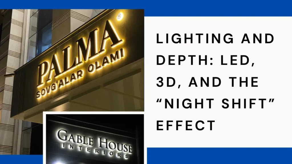
A sign can have two personalities: daytime and nighttime. That’s not a problem—if you plan for it.
LED signboard design is less about “making it bright” and more about controlling attention. Even light distribution, edges, and the right color temperature help a sign board design look professional rather than harsh. Depth changes perception, too. 3D signboard design—raised letters, layered panels, and halo-lit elements—creates shadows that make text readable from angles, especially on busy streets.
If you’ve ever seen a sign board design that looked premium at night but flat in daylight, the daytime materials were usually an afterthought. Balance both conditions from the start.
The science of legibility (and why your eyes love simple choices)
There’s a reason you can read some signs instantly, and others feel like a puzzle. Your brain is trying to recognize words while your eyes fight distance, motion, glare, and clutter.
Two design moves consistently win:
- Strong hierarchy: the name first, the category second, and the extras last (if they belong on the board at all).
- Comfortable spacing: letters that don’t touch, lines that don’t crowd, and margins that give the message room.
Letter size, placement, and contrast matter more than effects. The sign board design Research Foundation collects practical guidance on what improves readability on real streets, including letter height.
For a quick gut check, try the “walk-by test”: look for two seconds, then look away. If you can’t recall the name clearly, simplify.
A simple workflow from idea to installation
Most signage problems aren’t “bad taste.” They’re workflow problems—skipping steps and paying for it later.
A practical process looks like this:
Site check. Stand where customers stand. Note distances, sightlines, and competing signs.
Message trimming. Reduce your copy until only the essentials remain. The board is for identity; details can live on doors, windows, menus, or digital listings.
Mockups that match reality. Overlay the design onto a photo of the façade. Check how it feels next to neighboring storefront signage and how it reads from the approach angle.
Production decisions. Confirm mounting method, edge finishes, cable paths (for lighting), and access for cleaning or repairs.
It’s also useful to notice what doesn’t change. The best storefronts keep the core identity consistent and refresh only supporting elements—window graphics, temporary panels, and seasonal messaging. Community updates on Facebook can be a surprisingly practical way to spot those patterns over time.
This flow protects creativity. When the basics are solved early, creative signage ideas have room to shine.
Common mistakes that quietly cost you attention
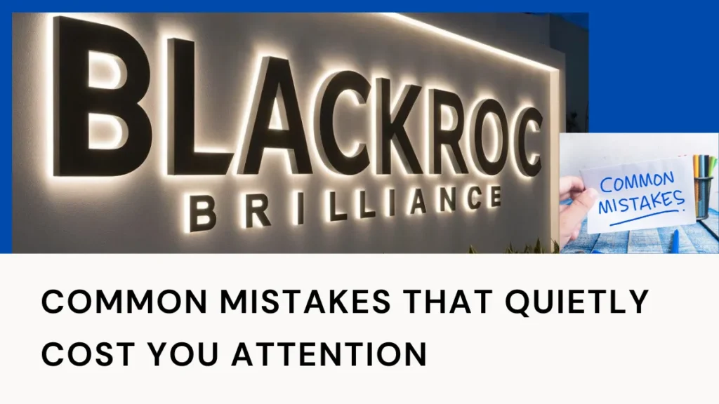
Some sign problems don’t look like “mistakes” until you see them in the real world.
Too much text. People won’t read paragraphs on an advertising sign board design. If you need five claims to explain yourself, the sign board design is doing the wrong job.
Low-contrast palettes. Trendy gray-on-gray can feel modern—until the sun hits it and the words vanish.
Wrong scale. A logo that fills the board can crowd out the name. A name that’s too small forces people to squint (and they won’t).
Overdecorated effects. Shadows, gradients, and outlines can help—until they start fighting each other. If every letter has three treatments, none of them feels intentional.
Ignoring local approvals. Many cities regulate sizes, placement, and illuminated signage. A quick check of your local requirements early on can save redesigns later.
Keeping signage fresh without constant redesign
Signs age the way shops do: slowly, then suddenly. Dust, sun, and small repairs add up fast.
If you’re evaluating options, it can also help to look at photos and reviews in context on a Google Business Profile. You’ll often see what people notice first: the entrance, the lighting, and the clarity.
A few habits keep a business signboard looking new:
- Pick finishes that wipe clean without scratching.
- Avoid tiny exposed edges where moisture can creep in.
- If you use illumination, make sure access points don’t require dismantling the entire board.
The next step when you want a sign that feels like your brand
Start with one feeling you want people to take away—“fresh,” “fast,” “family,” “premium,” “open late,” or “trusted.” Then choose the layout, material, and lighting that support that feeling.
If your space sits inside a plaza, office block, or mixed-use building, remember that wayfinding matters as much as style. People are often searching, not browsing—so commercial sign board design tends to work best when it’s calm, consistent, and easy to follow.
If you’re exploring ideas or need expert guidance, the right support can make a big difference—especially when your sign board design is the first conversation your business has with the street.