Table of Contents
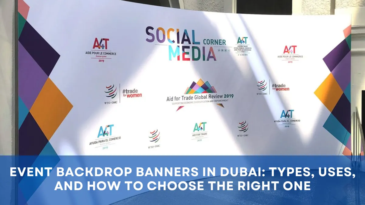
When a visitor notices your booth, storefront, or event entrance, the right banners and displays do more than fill space. They quietly guide attention, shape trust, and make people stop for one more second. And sometimes, that one second is everything.
That is why this topic deserves more care than most people give it. A display is not just a printed surface. It is often the first handshake, the first direction, and the first emotional signal your brand sends. If you are building a stronger signage strategy, start with your complete guide to branded visual solutions before diving into the formats below.
At a crowded exhibition, a slim retractable banner can act like a lighthouse. In a retail store, point of sale graphics can gently steer buyers toward a decision they were already close to making. At a corporate event, clean wayfinding signage can lower stress before anyone even reaches the registration desk. Different spaces ask for different tools, and the smartest choice is rarely the biggest one. It is the one that fits the moment, the movement, and the message.
Why the right format changes everything
A lot of brands choose signage by starting with size. That feels logical, but it usually leads to waste.
A better way is to start with behavior. What do you want people to do when they see the graphic?
Do you want them to:
- notice your brand from a distance
- walk in a specific direction
- understand one offer quickly
- pause for a product demo
- remember your company after the event ends
That simple shift changes everything.
A tall format works well when people are moving fast. A wider format works better when they are standing and comparing. Portable banner stands are useful when teams need fast setup, repeated transport, and low storage stress. For larger campaigns, booth layout planning tips can help you match display size with visitor flow instead of guessing.
The real beauty of great signage is that it feels effortless to the audience. They do not think about the engineering, the material, or the base structure. They only feel clarity.
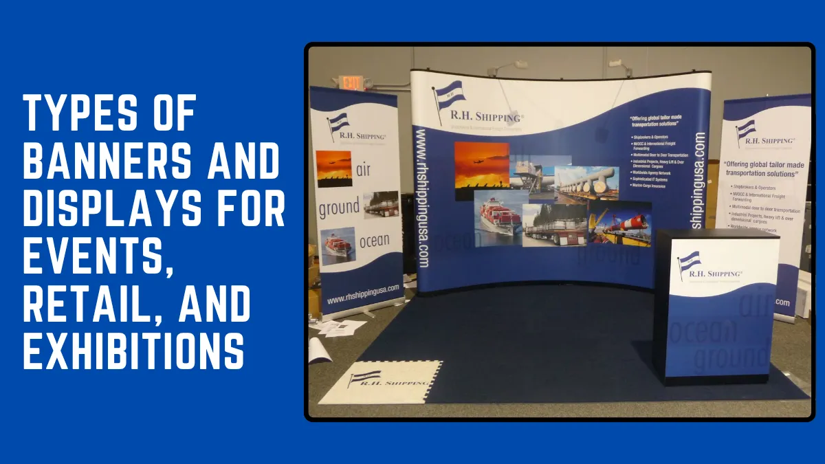
Types of banners and displays for different spaces
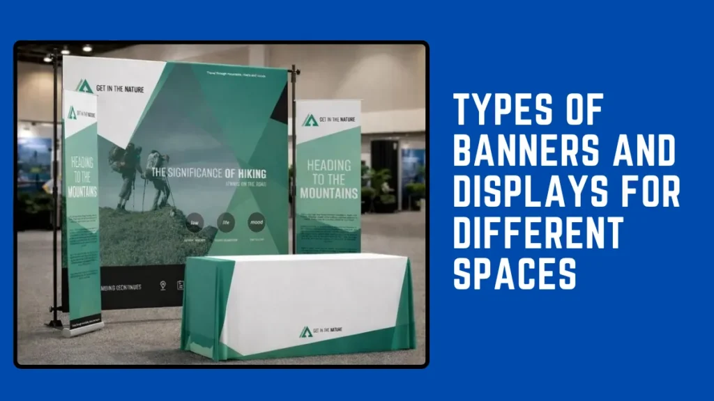
The best banners and displays are rarely one-size-fits-all. Events, retail settings, and exhibitions each create different emotional and physical conditions, so the display format should respond to the environment instead of forcing the same solution everywhere.
1) Trade show banners for busy aisles and fast impressions
Trade show floors are noisy, visual, and competitive. People are scanning quickly, often from the side, and they are making snap decisions about where to stop. That is why trade show banners need strong hierarchy above all else.
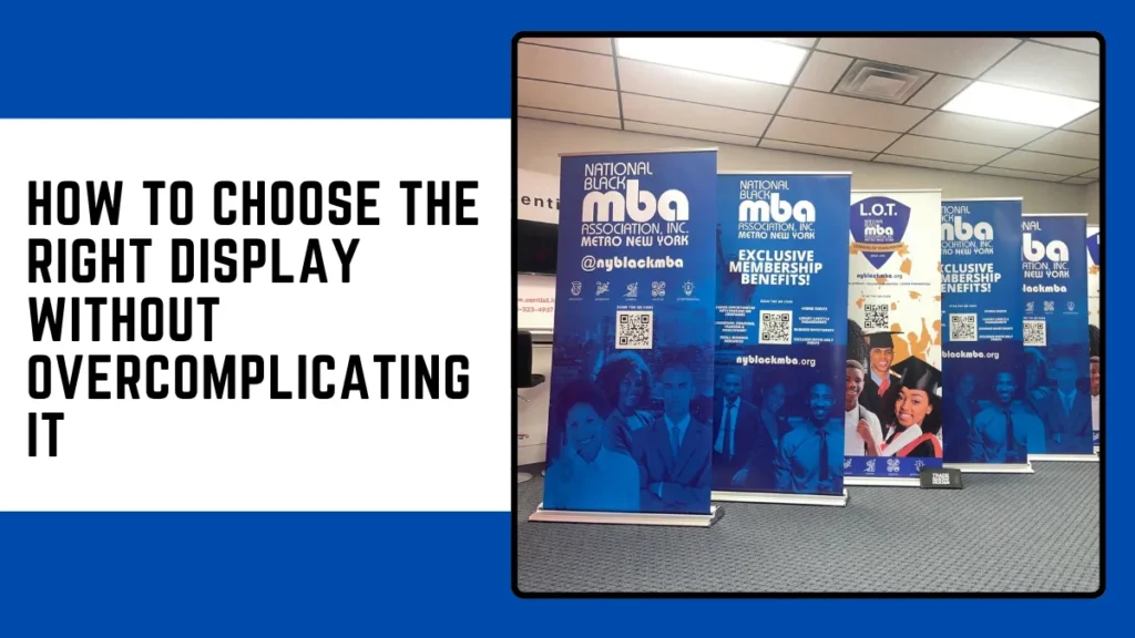
Retractable banners are one of the easiest wins here. They are portable, quick to install, and ideal for product highlights, directional messaging, or booth-edge branding. If your team travels often, they reduce setup fatigue and still look polished.
Pop up displays work differently. They create a larger branded backdrop and help define your space from a distance. When paired with portable banner stands, brochures, and simple lighting, they turn even a modest booth into a complete visual zone.
Exhibition displays also benefit from restraint. A crowded graphic usually disappears inside a crowded hall. A cleaner design with one message, one visual focus, and strong contrast tends to perform better. If you want a tighter booth strategy, this trade show graphics checklist is a useful next read.
For many brands, the strongest combination is:
- one backdrop for presence
- two side banners for supporting points
- one counter graphic for close-range conversation
That mix gives you distance visibility and close-up clarity without overwhelming the booth.
2) Retail displays that support browsing, trust, and impulse action
Retail is more intimate than an exhibition hall. People are not just passing by. They are browsing, comparing, hesitating, and imagining ownership. That means retail displays should feel less like interruption and more like guidance.
Indoor banners near entrances are good for seasonal campaigns, launches, or category highlights. Branded displays near shelves help customers connect a product to a wider story. Point of sale displays work best when they reduce decision friction rather than shout for attention.
Think about the emotional rhythm of a store.
At the door, people need orientation.
In the aisle, they need confidence.
At checkout, they need a final nudge.
That is where promotional displays become especially useful. A well-placed promotional piece can spotlight bundles, limited editions, or new arrivals without making the store feel cluttered. Retail signage is most effective when it respects the pace of the shopper.
Custom signage also helps unify the experience. When shelf talkers, hanging signs, floor graphics, and window visuals all feel connected, the store becomes easier to navigate and easier to trust. If you are refining store flow, this guide to retail signage ideas that improve customer movement can support your cluster strategy.
A good retail display does not pressure people. It reassures them.
3) Event signage that helps people feel oriented and welcomed
Events create a very specific kind of anxiety. People arrive not knowing where to park, where to queue, where to register, or whether they are already late. Good event signage reduces that tension before staff members even speak.
Outdoor banners are useful for visibility from the road, venue entrance branding, and directional cues. Indoor banners work better once guests are inside and need confirmation that they are in the right place. Event signage must be readable quickly, even when someone is walking, carrying a bag, or speaking to someone beside them.
This is also where custom display banners shine. A custom piece can combine branding, arrows, schedules, sponsor visibility, and space-specific messaging without feeling generic. For launches, conferences, school events, and community activations, that flexibility matters.
Large venues often need layered wayfinding:
- exterior arrival signs
- parking or entry direction boards
- registration banners
- stage or zone identifiers
- sponsor and photo-op backdrops
When those layers are designed together, the whole event feels calmer and more premium. Accessibility matters here too, especially in busy venues where clear directional signage reduces confusion for everyone. For broader event planning context, the IAEE’s accessibility guidance is worth reviewing alongside your own venue plan.
And yes, emotional tone matters here more than people think. A welcoming entrance graphic can make an event feel organized before a single presentation begins.
4) Exhibition displays that balance storytelling and structure
Exhibitions ask more from signage because they are part navigation, part branding, and part storytelling. Whether the space is commercial, cultural, educational, or corporate, the display system has to do several jobs at once.
Some exhibition displays are designed to stop traffic. Others are designed to hold attention longer. That difference affects everything from size to message density.
For quick attraction, advertising banners with bold headlines and clean imagery work well. For deeper engagement, wider walls, modular panels, and branded displays give you room to layer narrative, product detail, and visual proof. This is also where material choice becomes more noticeable. A tension fabric system feels different from a rigid mounted board, even before the viewer consciously processes why.
The strongest exhibition environments usually blend:
- hero graphics for attention
- information panels for education
- product or demo zones for interaction
- directional signage for movement
The best banners and displays in exhibitions do not just decorate space. They create a path through it.
Printing choices that shape quality more than most people expect
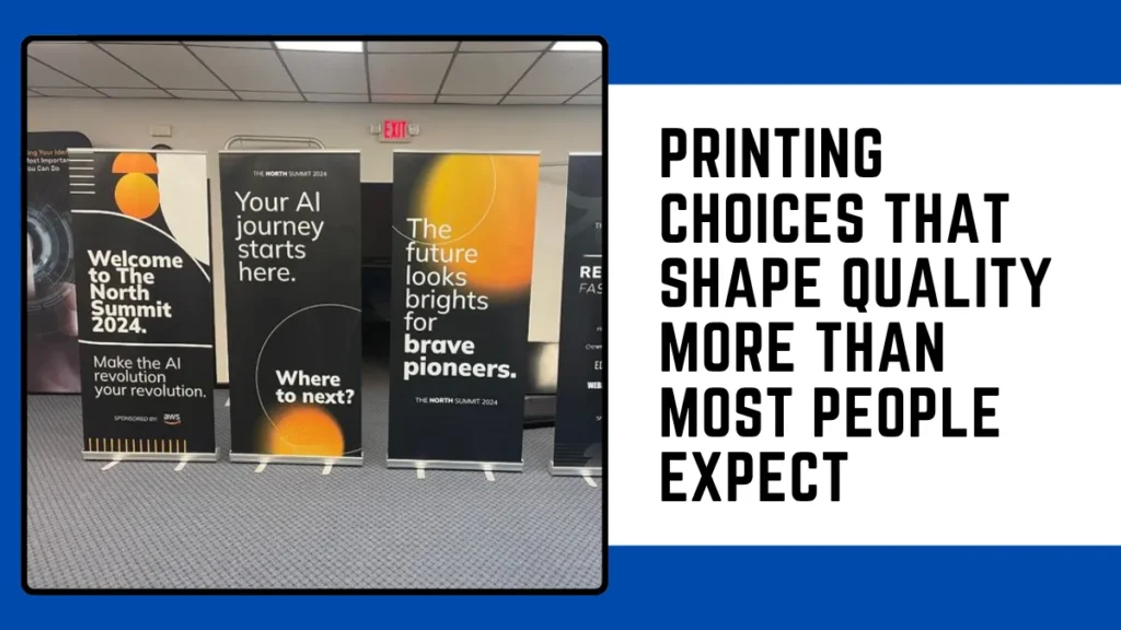
People often focus on layout first and printing second. In practice, print quality can rescue a decent design or ruin a strong one.
If the piece will be viewed up close, display printing needs crisp typography, clean edges, and balanced color reproduction. If the piece will be seen from across a hall, large format printing needs bold structure more than tiny detail. Distance changes design.
This is where banner printing services should be treated as production partners, not just order takers. The right supplier can guide you on material durability, finishing options, mounting choices, and resolution requirements before a costly mistake happens.
A few practical checks make a big difference:
- match material to environment for indoor banners versus outdoor banners
- simplify text when the display is meant for distance viewing
- leave safe margins around logos and key messages
- test color consistency across multiple branded pieces
- choose finishing that fits how often the item will travel
If you are preparing artwork, this large-format artwork guide can save hours of back-and-forth before production begins.
And if your campaign includes more than one piece, consistency matters. Window graphics, roll-ups, counter wraps, and hanging signs should feel related, even when the sizes differ. That is where a simple visual system beats a collection of random designs. For that reason alone, many teams build a small library of reusable layouts before sending files to print.
Common mistakes that make signage feel expensive but ineffective
Some displays fail quietly.
They are printed well. They look modern. They cost money. But they still do not work.
Usually, the problem is one of these:
- too many messages on one surface
- low contrast that disappears from a distance
- fonts that look stylish but read poorly
- imagery that feels generic instead of relevant
- no clear difference between primary and secondary information
- the wrong format for the setting
A retail poster designed like a trade show backdrop feels heavy. A trade show banner designed like a shelf label feels weak. A beautiful event welcome board without directional logic becomes decoration, not guidance.
The most effective visual systems are built with humility. They accept that people are busy, distracted, and selective. They do not ask for perfect attention. They earn fast understanding.
If you want to see how real-world layouts come together, our Instagram page is a helpful place to browse ideas across storefronts, events, and branded spaces. For updates and project inspiration, our Facebook page also shares practical examples from day-to-day work.
How to choose the right display without overcomplicating it
If you are deciding between several formats, ask four questions:
Where will people see it?
A mall corridor, an expo hall, a hotel ballroom, and a sidewalk all demand different materials and reading distances.
How long will it stay up?
A one-day activation may need portability. A long campaign may need tougher materials and more stable structures.
How fast will people read it?
Fast traffic needs fewer words. Slower spaces allow more explanation.
What do you want people to remember?
Not everything needs to be said. Usually, one strong message travels further than five average ones.
That is also why a mixed system often works best. One brand may need retractable banners for events, window graphics for promotions, point of sale displays for checkout, and custom signage for permanent retail identity. None of these formats compete with each other when each one has a clear role.
Closer to launch time, it also helps to review installation, access, and local support. If you prefer to see where the team is based before moving ahead, you can find Unitec Advertising L.L.C on Google Maps and get a better sense of local presence without turning the process into a hard sell.
The smartest banners and displays are not the loudest ones. They are the ones that make the next step feel obvious.
Need expert guidance? Our team is here to help when you’re ready.
What are the best trade show banners for small booths?
Retractable banners are usually best for small booths because they save space, are easy to carry, and show one clear message.
How are custom display banners different from standard banners?
Custom display banners are made for a specific space, purpose, or brand, with tailored sizes, materials, and designs.
Which works better for stores: indoor banners or point of sale displays?
Both work well. Indoor banners build visibility, while point of sale displays encourage last-minute purchases.
Are retractable banners good for events and exhibitions?
Yes, they are portable, quick to set up, and ideal for booths, entrances, and registration areas.
What should I look for in banner printing services?
Choose a service that helps with materials, finishing, color quality, and file setup—not just printing.
How do banners and displays help customer experience?
They make spaces easier to navigate, highlight offers, build trust, and reduce confusion.